Hi, Ada here. PR-to-UX Designer.
I strive to design effective experiences that resonate with the users and inspire them to engage with the story.


METTRE
Mobile App + Information Design
A jewelry shopping app that uses virtual try-on and sharing features to mimic real world experiences in COVID-19 times and increase audience reach for small brands.
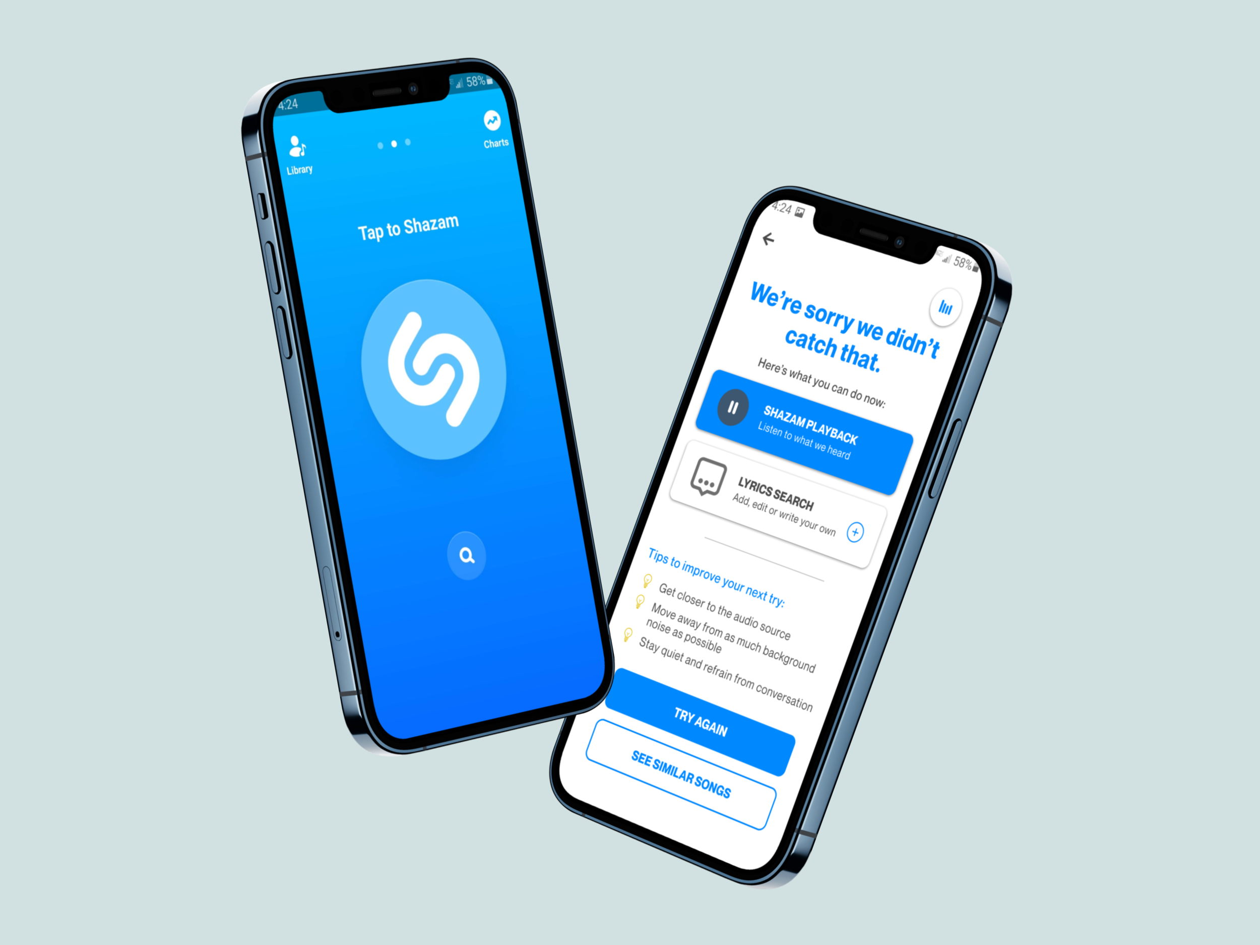
SHAZAM
Mobile App Iteration
New features to improve results and user satisfaction while staying true to the original service.

JON MARQUEZ PHOTOGRAPHY
Web + Information Design
An elegant website for studio portrait service that promotes the brand identity and optimizes the customer’s scheduling experience.

KAUS
Web + Information Design
A modern brand refresh and e-commerce website for insurance giant focusing on accessibility and appeal for existing customers and new, younger audiences.